Joint design system
From 0 to 1: designed and scaled Weedmaps' company-wide design system, now the foundation every product team builds on.
30% faster delivery time
100% team adoption


Before
After
No system, no source of truth
Teams guessed at which patterns to use, one-off components increased, non-semantic naming.
One system, one source of truth
Semantic tokens, linked components, and a single update at the source cascades everywhere.
Fragmented, inconsistent surfaces
Without shared patterns, surfaces drifted apart over time, eroding trust in the product.
Consistent, cohesive surfaces
Reusable, documented components replaced one-off builds across the product
Slow development
Engineers rebuilt UI from scratch and any global changes were done page by page.
Faster shipping, built for what's next
Faster ENG handoff, semantic token architecture now lays the groundwork for AI-assisted, prompt-based design.
Before
One system, one source of truth
Semantic tokens, linked components, and a single update at the source cascades everywhere.
Consistent, cohesive surfaces
Reusable, documented components replaced one-off builds across the product
Faster shipping, built for what's next
Faster ENG handoff, semantic token architecture now lays the groundwork for AI-assisted, prompt-based design.
After
The process
Auditing
When the project started, there were multiple patterns in use but no consensus on when or why to use one over another. Each element found on the live site was cataloged and then discussed with the design leads to determine a component or tokens desired use case.
If multiple patterns existed for the same use case, we made a decision on which pattern would be the standard.
Auditing
When the project started, there were multiple patterns in use but no consensus on when or why to use one over another. Each element found on the live site was cataloged and then discussed with the design leads to determine a component or tokens desired use case.
If multiple patterns existed for the same use case, we made a decision on which pattern would be the standard.


Defining tokens
Color, typography, spacing, corner radii, and elevations. After auditing, standard values of each were determined and variables were created, allowing our designs to always be cohesive with one another.
Semantic names were given to tokens to avoid their usage being left up to interpretation. Tokens were now referred to by their specific usage. Engineering was looped in so that both design and ENG spoke the same language.
Once AI entered the picture, these tokens became essential in avoiding drift, serving as guardrails so that values defined by a token were used.
Defining tokens
Color, typography, spacing, corner radii, and elevations. After auditing, standard values of each were determined and variables were created, allowing our designs to always be cohesive with one another.
Semantic names were given to tokens to avoid their usage being left up to interpretation. Tokens were now referred to by their specific usage. Engineering was looped in so that both design and ENG spoke the same language.
Once AI entered the picture, these tokens became essential in avoiding drift, serving as guardrails so that values defined by a token were used.
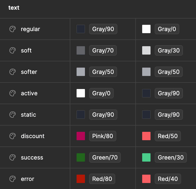
Colors
To facilitate the large variety of considerations that could influence a color choice, a naming system was established so that there would be a consistent way for designers to see the exact use case.
Color names were composed of up to 5 descriptor types: element, sentiment, prominence, interaction state, and view mode. Each color token was tied back to a primitive color scale value.
Any relevant descriptors were combined to create the color name. For instance, a success fill color in its hover state would be "fill.success.hover". On the Figma side of things, light and dark mode were handled using variable properties and were typically omitted.
Element
Text
Fill
Outline
Icon
Effect
Sentiment
Success
Warning
Error
Discount
Verified
Prominence
Bolder
Bold
Regular
Soft
Softer
Interaction
Default
Hover
Focus
Activated
Disabled
View mode
Light
Dark
Static
Type
Typefaces were more straightforward than our colors. Through our audit, we narrowed down our typefaces to a set of 6 headings and 3 paragraph options. With supporting documentation to clarify, we named our type styles after their desired usage.
Type
Typefaces were more straightforward than our colors. Through our audit, we narrowed down our typefaces to a set of 6 headings and 3 paragraph options. With supporting documentation to clarify, we named our type styles after their desired usage.

Icons
Icons were set up with multiple variants for different sizes. Larger sized icons had reduced stroke weight so that they always looked aligned with other icons at different sizes.
Our icons used an outline style, with filled variants to represent an active state.
Icons
Icons were set up with multiple variants for different sizes. Larger sized icons had reduced stroke weight so that they always looked aligned with other icons at different sizes.
Our icons used an outline style, with filled variants to represent an active state.

Spacing and Radii
Like our other token types, spacing and radii tokens allowed for easy global changes.
These also ensured that AI agents would never drift from our desired spacing rules.
Spacing and Radii
Like our other token types, spacing and radii tokens allowed for easy global changes.
These also ensured that AI agents would never drift from our desired spacing rules.
gap.4
gap.8
gap.12
gap.16
radius.8
radius.16
radius.24
modal
Building components
With the base building block components established, the component library was created. Figma variants allowed components to maintain a level of customizability, while still falling back on some level of structure to keep everything within our system.
Larger components were made up of shared subcomponents, which allowed for more customization and more shared elements.
Components were set up to match the same responsive behavior they would have on the live site, so designers could always get an accurate picture of how their designs would adapt.
Anything that needed to be reusable became a component. This ranged from simple patterns such as buttons, to more complex and customizable elements like modals.


Documentation
Each token and component was given detailed documentation that lived inside the Figma file and inside story book. Documentation expanded on usage guidelines for designers, responsive behavior, functionality, and the different states and variables available.
Impact
There was a period of needed culture shift where engineers shifted to going to the design system first, rather than looking at what's on other pages. This also implied a new process where if a discrepancy was noticed, engineers would reach out to designers for clarity or corrections. If something was outside the design system, it was the designers responsibility to add it or replace it with another component.
The end result of it all: Things were more consistent, global changes were easier to make, development time was shorter, and we were prepared to integrate AI tools.
Impact
There was a period of needed culture shift where engineers shifted to going to the design system first, rather than looking at what's on other pages. This also implied a new process where if a discrepancy was noticed, engineers would reach out to designers for clarity or corrections. If something was outside the design system, it was the designers responsibility to add it or replace it with another component.
The end result of it all: Things were more consistent, global changes were easier to make, development time was shorter, and we were prepared to integrate AI tools.
30% reduction in delivery time
100% adoption across product design team
90+ shared library components
MCP server and code connect enabled designers to contribute code with AI.
Element
Text
Fill
Outline
Icon
Effect
Sentiment
Success
Warning
Error
Discount
Verified
Prominence
Bolder
Bold
Regular
Soft
Softer
Interaction
Default
Hover
Focus
Activated
Disabled
View mode
Light
Dark
Static
Building components
With the base building block components established, the component library was created. Figma variants allowed components to maintain a level of customizability, while still falling back on some level of structure to keep everything within our system.
Larger components were made up of shared subcomponents, which allowed for more customization and more shared elements.
Components were set up to match the same responsive behavior they would have on the live site, so designers could always get an accurate picture of how their designs would adapt.
Anything that needed to be reusable became a component. This ranged from simple patterns such as buttons, to more complex and customizable elements like modals.
Impact
There was a period of needed culture shift where engineers shifted to going to the design system first, rather than looking at whats on other pages. This also implied a new process where if a discrepency was noticed, engineers would reach out to designers for clarity or corrections. If something was outside the design system, it was the designers responsibility to add it or replace it with another component.
The end result of it all: Things were more consistent, global changes were easier to make, development time was shorter, and we were prepared to integrate AI tools.
Type
Typefaces were more straightforward than our colors. Through our audit, we narrowed down our typefaces to a set of 6 headings and 3 paragraph options. With supporting documentation to clarify, we named our type styles after their desired usage.

Icons
Icons were set up with multiple variants for different sizes. Larger sized icons had reduced stroke weight so that they always looked aligned with other icons at different sizes.
Our icons used an outline style, with filled variants to represent an active state.
Documentation
Each token and component was given detailed documentation that lived inside the Figma file and inside story book. Documentation expanded on usage guidelines for designers, responsive behavior, functionality, and the different states and variables available.
Spacing and Radii
Like our other token types, spacing and radii tokens allowed for easy global changes.
These also ensured that AI agents would never drift from our desired spacing rules.
gap.4
gap.8
gap.12
gap.16
radius.8
radius.16
radius.24
modal