Map redesign
A redesign of Weedmaps' map page aiming to modernize the experience and give it a holistic face-lift.
20% more menu visits
50% reduced time to checkout
Before

After

Before
After
Incremental additions grew into inconsistency
As the map page expanded with more and more features, it became less consistent.
Elements addressed holistically
Past changes were addressed by looking at them in the context of the entire experience.
Accessibility gaps
Inconsistent tap targets, hard to see buttons, and hard-to-find functionality.
Improved accessibility
Larger tap targets, buttons aligned with the design system, and functionality more clearly called out.
Cluttered and dated
Information was jammed inside a small area, making the content hard to parse and the actions unclear.
Organized and modern
Information was reorganized to read more naturally and separate actions into more logical groups.
Before
Elements addressed holistically
Past changes were addressed by looking at them in the context of the entire experience.
Improved accessibility
Larger tap targets, buttons aligned with the design system, and functionality more clearly called out.
Organized and modern
Information was reorganized to read more naturally and separate actions into more logical groups.
After
The process
Auditing
Each state and function of the original experience was cataloged and analyzed to identify gaps, and ensure that all functionality was accounted for.
Since maps was a high traffic area, there was more concern around potential changes. Aligning with stakeholders often and early helped clear the path.
Auditing
Each state and function of the original experience was cataloged and analyzed to identify gaps, and ensure that all functionality was accounted for.
Since maps was a high traffic area, there was more concern around potential changes. Aligning with stakeholders often and early helped clear the path.



Structure
Opportunities to improve the underlying structure were identified with the old flow. Shoppers would have to tap through a location details screen to see a menu, and the menu itself would show the same information that the details page displayed.
This redundant step was removed from the list view, now users would be brought straight to the menu, and one step closer towards checkout.
Structure
Opportunities to improve the underlying structure were identified with the old flow. Shoppers would have to tap through a location details screen to see a menu, and the menu itself would show the same information that the details page displayed.
This redundant step was removed from the list view, now users would be brought straight to the menu, and one step closer towards checkout.
Before
List view
User taps a location
Location details
User taps view menu
Location menu
After
List view
User taps a location
Location menu
Layout
The original layout was a bit confusing, information was packed together, and the underlying structure of the flow lead to some redundant actions.
With the update, information was laid out in a more straightforward way. Our new card stylings gave emphasis to the location, and any details were cleanly laid out in a list view. Filters were updated to use the most recent pattern being implemented across the site.
Actions were moved into more logical groups. The favorite button now lived with the close and share buttons to match the pattern that had been established on other areas of the site.
Location actions were now separated into their own group, no longer mixed in with deal tags. The deal tags were grouped with the re-labeled "Shop" button to make the association between the two more clear.
Layout
The original layout was a bit confusing, information was packed together, and the underlying structure of the flow lead to some redundant actions.
With the update, information was laid out in a more straightforward way. Our new card stylings gave emphasis to the location, and any details were cleanly laid out in a list view. Filters were updated to use the most recent pattern being implemented across the site.
Actions were moved into more logical groups. The favorite button now lived with the close and share buttons to match the pattern that had been established on other areas of the site.
Location actions were now separated into their own group, no longer mixed in with deal tags. The deal tags were grouped with the re-labeled "Shop" button to make the association between the two more clear.

Interactions
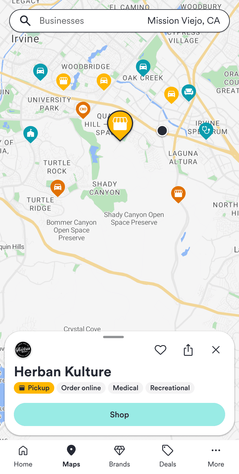
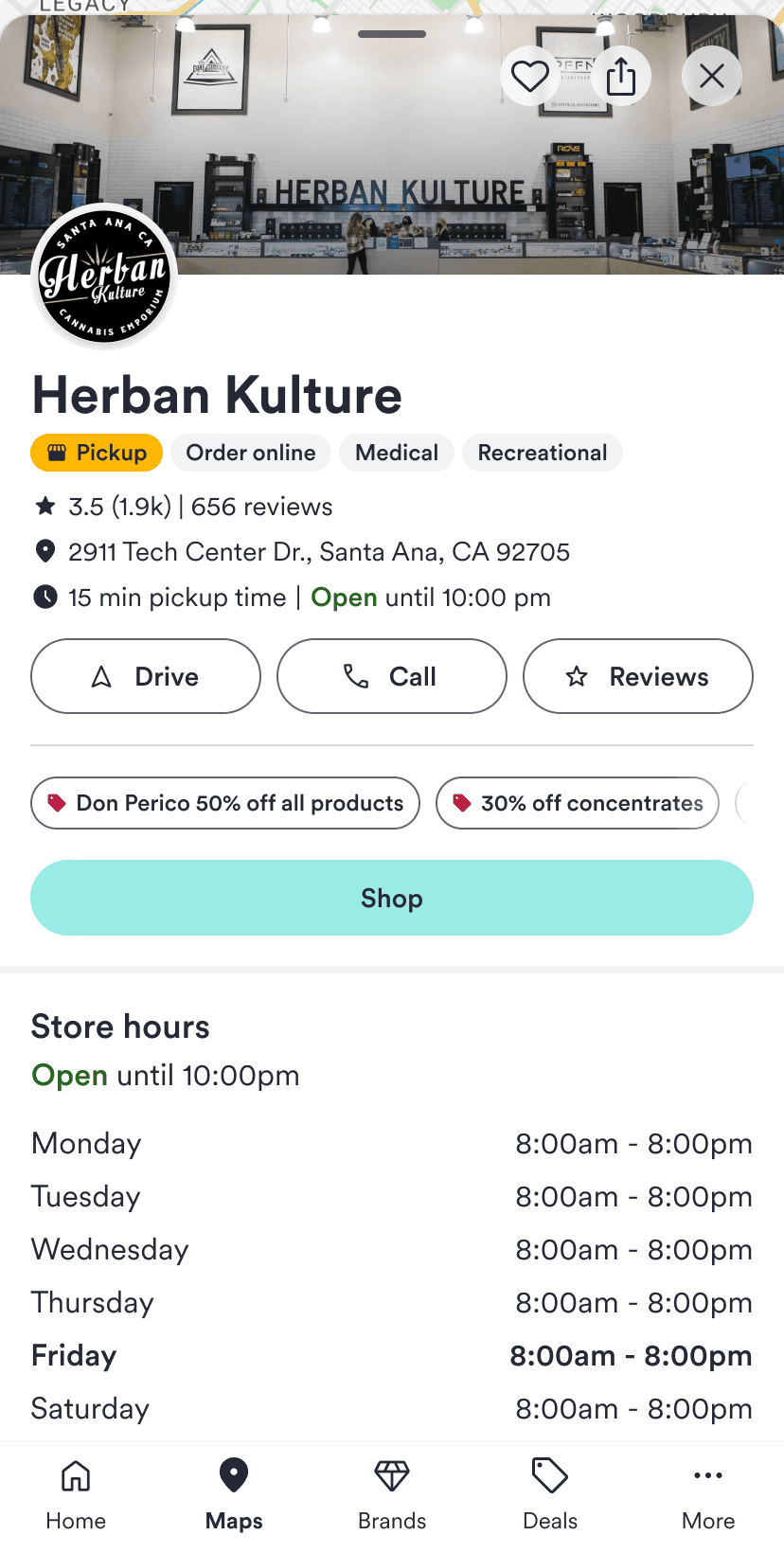
Inspired by Apple maps, we designed our listing preview card to smoothly transition between states, so that the user could see some information and still explore the map, or swipe up to see the complete list of details.
This also unlocked the ability to show additional content, such as a location's photo, in our expanded view
To illustrate the transition, a proof of concept was made with Figma Make, and then I worked with developers to polish out the final product.
Interactions
Inspired by Apple maps, we designed our listing preview card to smoothly transition between states, so that the user could see some information and still explore the map, or swipe up to see the complete list of details.
This also unlocked the ability to show additional content, such as a location's photo, in our expanded view
To illustrate the transition, a proof of concept was made with Figma Make, and then I worked with developers to polish out the final product.
Impact
Less taps needed to get the user shopping, and an improved browsing experience allowed the user to find what they want much sooner.
Consistent pattern implementation made the maps page once again feel like the rest of the site, restoring some much needed trust.
This was rolled out alongside a codebase migration, and contributed to a 50% reduced time to checkout
Impact
Less taps needed to get the user shopping, and an improved browsing experience allowed the user to find what they want much sooner.
Consistent pattern implementation made the maps page once again feel like the rest of the site, restoring some much needed trust.
This was rolled out alongside a codebase migration, and contributed to a 50% reduced time to checkout